The colour that you use when creating the packaging of your product is a very critical factor in its overall success within a consumer driven market.
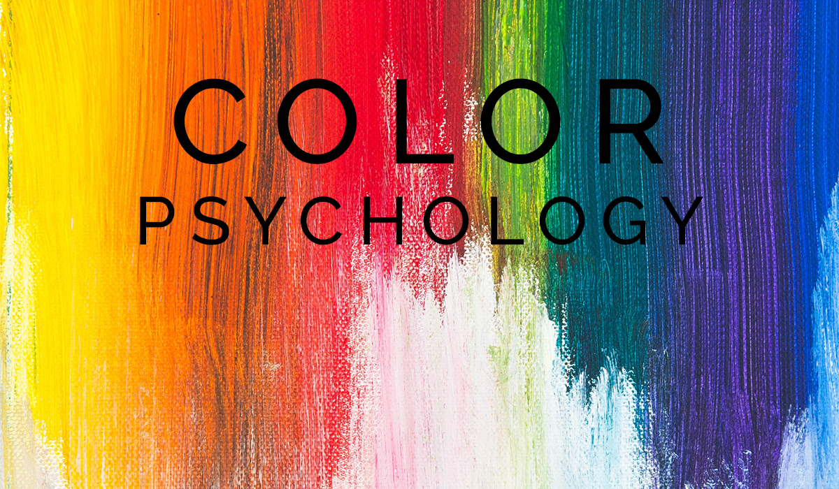
The reason for this is the emotion that colours evoke. Or as Designrfix says, because colours have their own psychology.
What this means is that people associate a particular meaning to a particular colour and this meaning changes not only from person to person, but also from culture to culture.
And how a product makes us feel (its emotive characteristics) is what drives our decision making process in purchasing it.
Marketers today understand the psychology of colour.
They know that it significantly impacts consumer buying behaviour and product sales, so much so that a recent study indicated that colour accounts for 85% of the reason why someone decides to purchase a product.
And the reason is that due to preconceived notions, colour creates perception, it determines how a product or service will be viewed.
Moreso, the choice of colour also establishes brand recognition (being able to associate a product with a brand) and also communicates a company’s intrinsic personality, its character, with which consumers can identify.
So choosing the right colours to use has never been more critical.
What then are the various traits that people attribute to different colours?
Blue
Often associated with cleanliness and serenity. Also thought to create the impression of trust, dependability, intelligence, efficiency and strength. Blue is used by a range of brands including Dell, IBM, Facebook, American Express and even Oreo cookies.
Red
For some red insinuates power, energy, excitement and strength. For others, it denotes youthfulness or being bold. Think Coca Cola, Red Bull, Lego, Youtube, Virgin and H&M.
Orange
This colour is frequently associated with sensuality, stimulation and warmth. For some however orange is affiliated to feelings of playfulness, confidence, cheerfulness and adventure. Popular global brands using orange in their packaging and overall branding are Amazon, Fanta, Harley Davidson and Nickelodeon.
Black
Although a strong colour that can bring with it negative connotations, black often conveys a message of sophistication, glamour, status and class. Most fashion brands like Louis Vuitton, Yves Saint Laurent, Mango and Zara have variations of black incorporated into their packaging and logo design.
Green
Normally targeted at consumers who are eco-friendly or energy conscious being that green is perceived to be indicative of the environment. This colour is also associated with feelings of harmony, balance, peace, health and growth. Think Greenpeace, Animal Planet, Land Rover, BP and even Spotify.
White/Grey
Surprisingly, like black, the colour white is also seen to be a colour of strength. It is also thought to invoke feelings of purity, sterility, clarity and sophistication. Brands making use of these colours are Apple, Honda, Mercedes Benz and also the Cartoon Network.
Earth Tone Colours
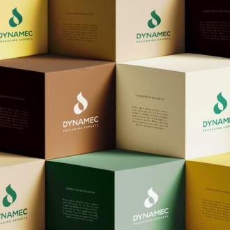
Earth tone colours generally seem to perpetuate the perception of something being warm, wholesome, appetizing and also natural. They also evoke feelings of security and reassurance. Hues incorporating earthy tones are most often used in the packaging and branding of eco-friendly, organic or natural food products. Whole Foods Market and Suma Wholefoods are great examples of having the earthy look.
Knowing the best colour or combination of colours to use and always taking into account the psychology that underlines the hue there will be a critical impact on influencing consumer behaviour so that they buy your product or service.
Use the right colours that communicate your brand’s message more effectively. Utilise the right shade to reflect the consumer and to target the specific buyer persona you are after.
At Dynamec we understand the impact of the psychology of colour on packaging and branding. So let us help you create the optimal brand message you want to relay to your customers – not through words – but through colour.


